An interview with Lynn Smith Dolby, curator of “From Studio to Doorstep”
July 21, 2022
From your perspective as the curator, could you please provide us with a brief overview of the timeline and processes for this exhibition?
Lynn Marsden-Atlass (University Curator and Executive Director of the Arthur Ross Gallery approached me in the late winter about the possibility of curating a show for the summer. I knew immediately that I wanted to do something with the Associated American Artists (AAA) prints in the University’s collection. I had been doing research into them since our Citizen Salon exhibition in 2018 & I got really excited about sharing these prints with visitors to the gallery.
The first step for me was going through our collections management database to get a handle on all the prints from AAA in the collection. Many of the prints were still in flat-file drawers, so it was a little bit of a treasure hunt!
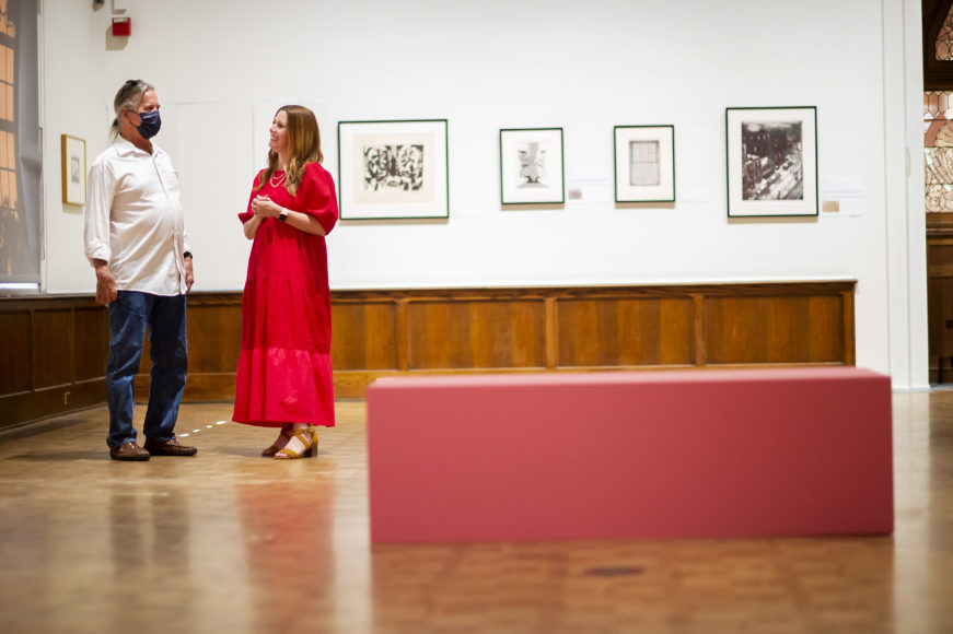
Some of the pieces were already beautifully framed and were basically exhibition ready. But 29 pieces had never been framed or exhibited. So, the next step was working with the framer to determine which color mat to use after we settled on a classic black frame for most of the pieces. Dorothy Dehner’s superb Mirage: Red & Black was an exception – I chose to float, rather than mat, this piece so that viewers could see the delicate edges of the paper and the use of a white frame further emphasizes the illusion that the piece is floating.
When it came time to create the “branding” for the show in the print material, I was really inspired by the advertisements for AAA from the 30s and 40s that I found in issues of Life magazine from the time. In my research, I also found a sample book of wallpapers that the company published in the 1950s. I wanted the entry space in the gallery to feel domestic, since these were all prints intended for the home. And, because most of the prints in the show are black and white – I knew that that the gallery would need a pop of color. I included a portfolio from William Gropper in the show, which is bright orange and one of my favorite color combinations is orange and pink. So, I found a mid-century color called “Pink Flamingo” and we used that for the back wall of the gallery, the bench, and of course, the legs of the exhibition case that holds the Gropper portfolio. The research and writing component of the show was another part of the process. Our summer intern, rising sophomore, Zoe Vaz, dove right in. Zoe wrote some of the extended labels in the show and lent her voice for the audio tour. Because we’re such a small office, our interns get a lot of hands-on experience!
What surprised you in preparing for this exhibition?
It’s always fun and surprising for me to see artworks “in the real” after looking at them in our database, which usually has just a tiny thumbnail image. Even though we do have the dimensions listed, I find that I must see the pieces in person to get a real sense of them. The Dorothy Dehner that I mentioned earlier was much bigger than I thought and had such a presence! The colors were so vibrant.
What were some of the main curatorial messages you hoped “From Studio to Doorstep” would convey?
It’s rare, for most of us, to go into an exhibition, look at the art on the walls, and think of it as something within reach for our own lives. AAA published artwork that was affordably priced and attainable for consumers with a little disposable income. I really want visitors to the gallery to feel at home with the pieces I selected for the show and to imagine themselves living with them, imagine themselves as collectors.
I hope that visitors find the show to be visually beautiful and also take away the impact that this company had on the distribution of American Art and culture.
Which five/three of the pieces do you enjoy the most? Why?
It’s so hard to choose favorites. As an art historian, people often ask me what my favorite artwork is and figuring that out is impossible. It’s like asking what my favorite food is – I could never decide – it depends on the day.
But I do have such a soft-spot for Thomas Hart Benton. We have a few of his AAA pieces in the collection, but the one I included Goin’ Home, I think, is special. The piece comes with a quote from the artist who explains that he sketched this from life in the Smokey Mountains of North Carolina. I think we can all relate to what we are seeing. Even if we have not been in a horse-drawn carriage before, we know what it’s like to either be a sleepy child, or have a sleepy child, falling asleep on the way home. I love that the artist puts us in his shoes so that we can imagine the scene.
I also want to shout out the women artists in the show – Grace Albee, Alice Standish Buell, Dorothy Dehner, Ethel Magafan, Sarah Sears and Norma Morgan who was an African American painter and printmaker for making beautiful and important work.
The history of Associated American Artists, according to what you stated in the exhibition’s introduction, “the story of Associated American Artists… is a story about the marketing and distribution of culture,” and “a story of aspiration and accessibility.” Why is the story still relevant nearly a century later? How can the narrative of culture’s distribution be reinvented in the era of information explosion?
When considering why this show is relevant now, I like to see these pieces through the lens of the shared experience of a collective tragedy. These early pieces were published at a time when the country was coming out of the Stock Market Crash and the Great Depression. Likewise, we are all coming out of the shared experiences of the COVID-19 pandemic. The imagery in the early days stressed resilience, family, work, and home. These are all issues that are very top-of-mind today, ones that we are still exploring.
The one piece that comes to mind is the 1939 “New York World’s Fair: Trylon and Perisphere” by John Taylor Arms. This fair was the first one based on the future, asking visitors to imagine “the world of tomorrow” – truly aspirational! It’s the fair that inaugurated broadcast television. It’s interesting to see this rendering of these modernistic structures depicting a “city of the future” among these other images from AAA from the time that are very nostalgic. I’m also captivated by the popularity of people traveling to various countries to attend the fairs in person. People still travel, of course, but today, it’s like we bring the world to us by looking at our phones.
How does this exhibition establish connections with the space of the gallery and, more broadly, with Penn and even the Philadelphia community?
I’m excited that Mary Tasillo from Penn Libraries, Common Press will be leading the 12@12 program on July 13th to talk about the printmaking process. She was a natural connection to make to this show to bring the medium to life for our visitors. AAA operated a gallery in Philadelphia from the late 70s to early 80s, led by Margo Dolan, who is still a print dealer in the city. I know that my research into this topic will continue beyond the length of the exhibition!
What specifically do you want Penn students to get out of the show?
I always feel like the University’s fine art collection is one of Penn’s hidden gems, that is also all around us. Everyone knows the monumental sculptures, like Simone Leigh’s Brick House, Split Button, and LOVE. There are works of art in 116 locations on campus – in offices, hallways, and conference rooms. But, because we don’t have a fine art museum, many works are only on view when they are curated into an exhibition at the Arthur Ross Gallery. So, this is a rare opportunity to get up close to artworks that have never been exhibited before.
Lynn Smith Dolby is the University Art Collection Manager & Assistant Curator, University of Pennsylvania
Photography by Eric Sucar